Throughout our production I feel as a whole we have conformed to the conventions of the horror thriller genre. We made these decisions so that we could clearly present that we had a strong understanding of the hybrid that we were exploring. This blog post is going to explore and present my personal and group development through research, planning, filming and post production.
Each section of the production helped us make informed decisions for the next section. I felt that I did very thorough research so that I could fully understand the codes and conventions of thrillers, which therefore helped me when it came to planning. For example I explored mise- en- scene, sound, camera work and titles very thoroughly which therefore made planning a lot easier; for example when searching for the font for our titles, I knew exactly the sort I was looking for: block, capitalised, black and 'jagged'. When going onto dafont.com I could quickly go into the section I thought was most suitable and find it which saved time and effort for the group as a whole, finding 'I Still Know' in a matter of minutes.
When we researched horror thriller I feel we were not rigorous enough, or driven enough to find out the knowledge we needed to help the rest of project. In total we analysed about 15 thrillers but from my point of view we would not have been as limited if we had analysed double the amount; it's difficult to realise how much it would help when you are in the research stages, this is why there is analytical blogs later on as I didn't recognise all the parts we would need to know about until later on. I feel this set us back as time was wasted when it could have been used in the allocated time.
The link between research and planning was ultimately the foundation for our final product yet there was lot to be done from that, as well as developing the conventions that we knew to make it our own. I felt that at the start of the course it was a rocky start due to not really understanding what was expected of me or how this was going to make things easier in the long run. However after the first weeks I got to grips with what I was doing and I felt that the research we found was very much reflected in our final piece especially in sound. From sound research I found that what you hear is reflective of what you see on the screen, this increases the intensity of the production. A clear example of this in our piece is when you see the antagonist opening the chloroform and you hear a loud bang- this connotes danger in the piece- personally I thought that was exaggerated in our piece which took the professional edge off our piece quite significantly. By analysing as many thrillers as I did independently, I found that my understanding of what was expected and needed to fit the code and conventions was very thorough which made planning much smoother especially through my research on how the audience would feel. By considering how the audience feel while watching a thriller it made what was expected of us very clear. In this, I mean that we knew that the audience need to feel in suspense, therefore we put our ending at the start to keep the audience guessing and building up the narrative throughout. As well as this the audience need to feel uneasy so our piece needed to be in a cold, isolated environment which lacks safety and warmth. These factors also influenced our final product.
From planning to product, I honest feel as a group we were poor and I feel this did actually bring our group down significantly. I feel that as a group there was a lot of laziness; our group devised early on a shooting schedule which would mean we could all make the time to go out and shoot together, however this was never followed. In addition to this I made 3 story boards which showed the shots we were going to use which was never followed; this is not always a disadvantage as sometimes angles you do not consider may look better but in our case we came to the shooting and most of the time we were considering what would look best whereas we could have got down to it. In addition to this our shot list which I made ordered was forgotten about when we came to shooting therefore none of planning was reflective in our production. I feel this let us down very strongly. The biggest disappointment for me was the fact that people didn't turn up to shooting therefore meaning as a group we didn't know what went well and what we needed to re-shoot, as personally I didn't feel that when I shot on my own I could recognise what went well and what didn't go as well. In addition to this I feel that I have learnt that when you are set a group task like this it is very difficult to trust your own opinion on the piece; for example the first ever shoot we did. The first shoot we did was the room where the girl is tied up and the male antagonist enters, we shot this and thought it was really good. Mr Ford watched it and pointed out what was good and bad. (The bad we had no even considered ourselves...) An outside perspective is extremely helpful.
Finally the filming to post production. Post production was a strength of ours as we had Prentice in our group, Prentice was very experienced with Premiere therefore we had our editing done quickly and efficiently as well as me personally leaning a lot along the way. Although I took a lot of time to look on YouTube and the school media page to learn how to use the program I also got a lot of help from Prentice. Prentice we take the footage we had done and have it edited nicely in an efficient space of time which was extremely helpful when it came to looking for gaps in our project. At the beginning of the post production process the editing was mostly done by Prentice, yet by the end I was happy to go onto the macs and do it myself which I think was an area I especially grew in. After we had filmed and edited in Premiere there was certain final touches we needed to add such as colour correction. Colour correction for me was one of the most important parts of the project as a lot of our project was filmed in high key lighting which took away from the horror thriller look we were going for- therefore by adding colour correction to our piece we were adding that cold, eerie look to our piece. Which, without I think our opening would have looked wrong. This is something I never even considered when looking back to the research parts of the project- I realised the significant coldness and eeriness throughout these openings but I feel it was something I had passively taken in.
Something I have learnt is although we are trying to represent thriller codes and conventions if you try too hard to include them all it may end up looking too much which I feel personally in ours we did. We tried to hard that it looked exaggerated and made parts of our project look tacky. I really do understand now the importance of each process as without the research we would not understand anything when it came to production and bringing the project together. From each stage it goes onto inform the next like stepping stones as well as building up my knowledge of media studies which will help for the exam.
(not complete)
Georgina Phillipps- Foundation Portfolio
Thursday, 24 April 2014
Monday, 21 April 2014
feed back:
Prentice made a questionaire which would help to answer the questions for our evaluation:
https://docs.google.com/forms/d/1gI7R83-J-BIcFVVSsO1rWd-J-nEHGq-_FHZNnDeuzAM/viewform?usp=send_form
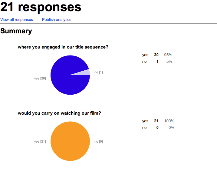
From the feedback we can conclude these results:

These results will help to make conclusion within our evaluation and as well to estimate how popular our opening was as well as what changes would be appropriate. We think that 21 people is an appropriate amount of people to take their conclusion from as it is on our blog therefore only people around our age group would be answer the questions; which is our target audience (teenagers). As well as this it is anonymous therefore we would not be finding out who gave their honest opinion- therefore making the questionnaire more reliable.
https://docs.google.com/forms/d/1gI7R83-J-BIcFVVSsO1rWd-J-nEHGq-_FHZNnDeuzAM/viewform?usp=send_form
From the feedback we can conclude these results:

These results will help to make conclusion within our evaluation and as well to estimate how popular our opening was as well as what changes would be appropriate. We think that 21 people is an appropriate amount of people to take their conclusion from as it is on our blog therefore only people around our age group would be answer the questions; which is our target audience (teenagers). As well as this it is anonymous therefore we would not be finding out who gave their honest opinion- therefore making the questionnaire more reliable.
Friday, 4 April 2014
Wednesday, 2 April 2014
Post production
After filming our pieces there are certain things we realised for example when filming you are focusing on not making the camera shake or making sure that its the perfect focus you may loose sight of things for example that the top of a head if people chopped out of the shot.
After my filming of joe and daisy we see here that I have chopped the top of his head off:
This shot was to keep the identity of the antagonist unidentified for the initial part of the opening. This however, look technically sloppy however it was the look we were going for. I think that it works well for us as we are keeping audience in suspense.
After my filming of joe and daisy we see here that I have chopped the top of his head off:
Moreover throughout editing we didn't realise that when filming something and having so many different versions of it you must look through all of them to find which one would look the best and out that onto your premiere pro timeline. For example after my filming last night with Daisy, I brought the camera in to do editing today and found that I had 20 different versions of the shots that I needed to incorporate. I did this so that when it came to editing I could make sure which shot was the best and having longer ones so that if I decide I would like to cut it later I can.
This shot was a shot which we had to put into our piece at the very last minute when we realised that our actor had broken their leg. Here you can see that the camera is tilted.
Props

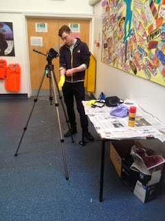
For one of our scenes here Prentice has the idea to cover an art glue spray can with the words chloroform written on. "Chloroform has been reputed to be used by criminals to knock out, daze or even murder their victims." Therefore in this context our antoginst is presenting the audience that he is going to use this on the female protagonist.
final decisions
As we come to the end few days of our project we are being faced with final decisions that we need to be making for example; how our ending will end (fade or cut), how consistent we want our lighting to be throughout and how we want our credits to roll throughout or whether they should be at the end. Through the progression of our project we can take that it is heavily a horror thriller- we have used music to make it dramatic, we have stuck to those codes and conventions and we incorporated font to match what we are trying to present.
Within our group today, Prentice and I have edited the final part of our footage (which I filmed last night with Daisy) and put it into our 2 minute opening. For this part of our project we have used parallel editing to present the binary opposition for the two characters through the lighting and surroundings we have used for one character and another. For example we thought it were best if the girl (the protagonist) of the piece were to be connoted as innocent through her white walled, open and clean house which has bright clear colour correction. Against our male character who is seen setting up in a cluttered environment which is filthy and generally dull.
Finally in our piece after editing and perfecting the narrative we had our piece to two minutes and thought it all looked perfect and how we wanted- however we have not put our credits in. Therefore I have done some extra research of opening credits in horror thrillers to see if we can put the credits in which lie ontop of the filming.
My first example is The Purge:
The font is again very simple, capitalised and blocky which is reflective of my previous research. The font is small and almost missable on the screen if it was not for the colour white of it. Looking at the diegesis on the screen is very much dull and each part has its own colour therefore I think it would be a good idea if our piece's titles were white, small and capitalised. As well as this the writing of the start bit which aren't credits is the same font as the credits- therefore we must use the same font as the 'DINNER FOR TWO' so it is consistent.
All though this opening is very much different to ours it is still the same sub genre. The font here is similar to ours however the setting in general is a lot more bright and positive in comparison to ours. Therefore the red contrasts and incorporates the horror thriller idea which is something we do not need to do as ours already looks very much like a horror thriller. However I like the font they have used here and again is consistent throughout. Another thing I realised is that the opening titles in these bits are very much as the start quarter of these openings and fade out slowly.
From these two openings I can take this to our project and see that the openings credits when ontop of the film should be in the start quarter of the sequence, consistent block font, a contrasting colour to what you see and matching the titles at the start.
Subscribe to:
Comments (Atom)


