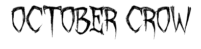


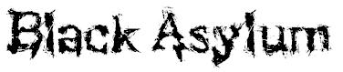
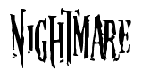
Above are some fonts that can be used in thrillers,usually used for the title of the film. In the title sequence they also use quite simple/minimalist fonts for names in the opening,some of the minimalist texts are animated with the style of the movie.
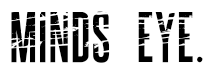
Our group feels that the font above would be most suited to a psychological thriller as it is similar to that which is used in shutter island-

The block and bold typography is to the point and professional, which we would like to reflect on our thriller opening.
Possible movie titles using the chosen font:
Done by Prentice Johnson- This analysis of typography is going to be important throughout our choice of target audience and thriller type. For example when we get our research and choose the target audience it will alter how to the typography will look- for example if we were to use a thriller that was based on psychology we would be looking for font that is clear and block as this will reflect upon the mind and is what a person would expect to see for that type of thriller. Yet if you were to look for a horror thriller the font maybe more abstract in order to represent writing written in blood for example. This research will be a big part of our opening as the writing that is written on the screen throughout the opening will bring the thriller together.


No comments:
Post a Comment