Throughout our production I feel as a whole we have conformed to the conventions of the horror thriller genre. We made these decisions so that we could clearly present that we had a strong understanding of the hybrid that we were exploring. This blog post is going to explore and present my personal and group development through research, planning, filming and post production.
Each section of the production helped us make informed decisions for the next section. I felt that I did very thorough research so that I could fully understand the codes and conventions of thrillers, which therefore helped me when it came to planning. For example I explored mise- en- scene, sound, camera work and titles very thoroughly which therefore made planning a lot easier; for example when searching for the font for our titles, I knew exactly the sort I was looking for: block, capitalised, black and 'jagged'. When going onto dafont.com I could quickly go into the section I thought was most suitable and find it which saved time and effort for the group as a whole, finding 'I Still Know' in a matter of minutes.
When we researched horror thriller I feel we were not rigorous enough, or driven enough to find out the knowledge we needed to help the rest of project. In total we analysed about 15 thrillers but from my point of view we would not have been as limited if we had analysed double the amount; it's difficult to realise how much it would help when you are in the research stages, this is why there is analytical blogs later on as I didn't recognise all the parts we would need to know about until later on. I feel this set us back as time was wasted when it could have been used in the allocated time.
The link between research and planning was ultimately the foundation for our final product yet there was lot to be done from that, as well as developing the conventions that we knew to make it our own. I felt that at the start of the course it was a rocky start due to not really understanding what was expected of me or how this was going to make things easier in the long run. However after the first weeks I got to grips with what I was doing and I felt that the research we found was very much reflected in our final piece especially in sound. From sound research I found that what you hear is reflective of what you see on the screen, this increases the intensity of the production. A clear example of this in our piece is when you see the antagonist opening the chloroform and you hear a loud bang- this connotes danger in the piece- personally I thought that was exaggerated in our piece which took the professional edge off our piece quite significantly. By analysing as many thrillers as I did independently, I found that my understanding of what was expected and needed to fit the code and conventions was very thorough which made planning much smoother especially through my research on how the audience would feel. By considering how the audience feel while watching a thriller it made what was expected of us very clear. In this, I mean that we knew that the audience need to feel in suspense, therefore we put our ending at the start to keep the audience guessing and building up the narrative throughout. As well as this the audience need to feel uneasy so our piece needed to be in a cold, isolated environment which lacks safety and warmth. These factors also influenced our final product.
From planning to product, I honest feel as a group we were poor and I feel this did actually bring our group down significantly. I feel that as a group there was a lot of laziness; our group devised early on a shooting schedule which would mean we could all make the time to go out and shoot together, however this was never followed. In addition to this I made 3 story boards which showed the shots we were going to use which was never followed; this is not always a disadvantage as sometimes angles you do not consider may look better but in our case we came to the shooting and most of the time we were considering what would look best whereas we could have got down to it. In addition to this our shot list which I made ordered was forgotten about when we came to shooting therefore none of planning was reflective in our production. I feel this let us down very strongly. The biggest disappointment for me was the fact that people didn't turn up to shooting therefore meaning as a group we didn't know what went well and what we needed to re-shoot, as personally I didn't feel that when I shot on my own I could recognise what went well and what didn't go as well. In addition to this I feel that I have learnt that when you are set a group task like this it is very difficult to trust your own opinion on the piece; for example the first ever shoot we did. The first shoot we did was the room where the girl is tied up and the male antagonist enters, we shot this and thought it was really good. Mr Ford watched it and pointed out what was good and bad. (The bad we had no even considered ourselves...) An outside perspective is extremely helpful.
Finally the filming to post production. Post production was a strength of ours as we had Prentice in our group, Prentice was very experienced with Premiere therefore we had our editing done quickly and efficiently as well as me personally leaning a lot along the way. Although I took a lot of time to look on YouTube and the school media page to learn how to use the program I also got a lot of help from Prentice. Prentice we take the footage we had done and have it edited nicely in an efficient space of time which was extremely helpful when it came to looking for gaps in our project. At the beginning of the post production process the editing was mostly done by Prentice, yet by the end I was happy to go onto the macs and do it myself which I think was an area I especially grew in. After we had filmed and edited in Premiere there was certain final touches we needed to add such as colour correction. Colour correction for me was one of the most important parts of the project as a lot of our project was filmed in high key lighting which took away from the horror thriller look we were going for- therefore by adding colour correction to our piece we were adding that cold, eerie look to our piece. Which, without I think our opening would have looked wrong. This is something I never even considered when looking back to the research parts of the project- I realised the significant coldness and eeriness throughout these openings but I feel it was something I had passively taken in.
Something I have learnt is although we are trying to represent thriller codes and conventions if you try too hard to include them all it may end up looking too much which I feel personally in ours we did. We tried to hard that it looked exaggerated and made parts of our project look tacky. I really do understand now the importance of each process as without the research we would not understand anything when it came to production and bringing the project together. From each stage it goes onto inform the next like stepping stones as well as building up my knowledge of media studies which will help for the exam.
(not complete)
Thursday, 24 April 2014
Monday, 21 April 2014
feed back:
Prentice made a questionaire which would help to answer the questions for our evaluation:
https://docs.google.com/forms/d/1gI7R83-J-BIcFVVSsO1rWd-J-nEHGq-_FHZNnDeuzAM/viewform?usp=send_form
From the feedback we can conclude these results:
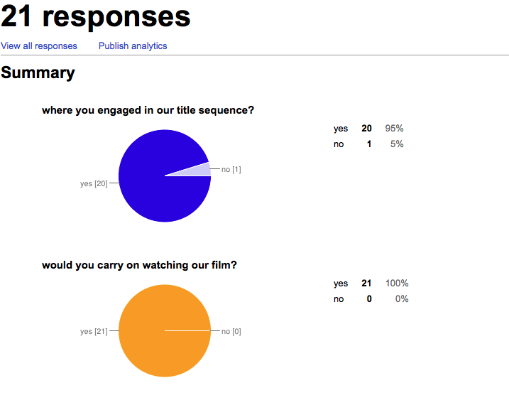
These results will help to make conclusion within our evaluation and as well to estimate how popular our opening was as well as what changes would be appropriate. We think that 21 people is an appropriate amount of people to take their conclusion from as it is on our blog therefore only people around our age group would be answer the questions; which is our target audience (teenagers). As well as this it is anonymous therefore we would not be finding out who gave their honest opinion- therefore making the questionnaire more reliable.
https://docs.google.com/forms/d/1gI7R83-J-BIcFVVSsO1rWd-J-nEHGq-_FHZNnDeuzAM/viewform?usp=send_form
From the feedback we can conclude these results:
These results will help to make conclusion within our evaluation and as well to estimate how popular our opening was as well as what changes would be appropriate. We think that 21 people is an appropriate amount of people to take their conclusion from as it is on our blog therefore only people around our age group would be answer the questions; which is our target audience (teenagers). As well as this it is anonymous therefore we would not be finding out who gave their honest opinion- therefore making the questionnaire more reliable.
Friday, 4 April 2014
Wednesday, 2 April 2014
Post production
After filming our pieces there are certain things we realised for example when filming you are focusing on not making the camera shake or making sure that its the perfect focus you may loose sight of things for example that the top of a head if people chopped out of the shot.
After my filming of joe and daisy we see here that I have chopped the top of his head off:


This shot was to keep the identity of the antagonist unidentified for the initial part of the opening. This however, look technically sloppy however it was the look we were going for. I think that it works well for us as we are keeping audience in suspense.
After my filming of joe and daisy we see here that I have chopped the top of his head off:
Moreover throughout editing we didn't realise that when filming something and having so many different versions of it you must look through all of them to find which one would look the best and out that onto your premiere pro timeline. For example after my filming last night with Daisy, I brought the camera in to do editing today and found that I had 20 different versions of the shots that I needed to incorporate. I did this so that when it came to editing I could make sure which shot was the best and having longer ones so that if I decide I would like to cut it later I can.
This shot was a shot which we had to put into our piece at the very last minute when we realised that our actor had broken their leg. Here you can see that the camera is tilted.
Props

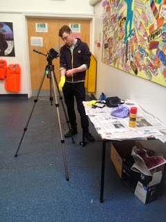
For one of our scenes here Prentice has the idea to cover an art glue spray can with the words chloroform written on. "Chloroform has been reputed to be used by criminals to knock out, daze or even murder their victims." Therefore in this context our antoginst is presenting the audience that he is going to use this on the female protagonist.
final decisions
As we come to the end few days of our project we are being faced with final decisions that we need to be making for example; how our ending will end (fade or cut), how consistent we want our lighting to be throughout and how we want our credits to roll throughout or whether they should be at the end. Through the progression of our project we can take that it is heavily a horror thriller- we have used music to make it dramatic, we have stuck to those codes and conventions and we incorporated font to match what we are trying to present.
Within our group today, Prentice and I have edited the final part of our footage (which I filmed last night with Daisy) and put it into our 2 minute opening. For this part of our project we have used parallel editing to present the binary opposition for the two characters through the lighting and surroundings we have used for one character and another. For example we thought it were best if the girl (the protagonist) of the piece were to be connoted as innocent through her white walled, open and clean house which has bright clear colour correction. Against our male character who is seen setting up in a cluttered environment which is filthy and generally dull.
Finally in our piece after editing and perfecting the narrative we had our piece to two minutes and thought it all looked perfect and how we wanted- however we have not put our credits in. Therefore I have done some extra research of opening credits in horror thrillers to see if we can put the credits in which lie ontop of the filming.
My first example is The Purge:
The font is again very simple, capitalised and blocky which is reflective of my previous research. The font is small and almost missable on the screen if it was not for the colour white of it. Looking at the diegesis on the screen is very much dull and each part has its own colour therefore I think it would be a good idea if our piece's titles were white, small and capitalised. As well as this the writing of the start bit which aren't credits is the same font as the credits- therefore we must use the same font as the 'DINNER FOR TWO' so it is consistent.
All though this opening is very much different to ours it is still the same sub genre. The font here is similar to ours however the setting in general is a lot more bright and positive in comparison to ours. Therefore the red contrasts and incorporates the horror thriller idea which is something we do not need to do as ours already looks very much like a horror thriller. However I like the font they have used here and again is consistent throughout. Another thing I realised is that the opening titles in these bits are very much as the start quarter of these openings and fade out slowly.
From these two openings I can take this to our project and see that the openings credits when ontop of the film should be in the start quarter of the sequence, consistent block font, a contrasting colour to what you see and matching the titles at the start.
Tuesday, 1 April 2014
titles on screen
From research we can take that the titles of our production should have the following titles:
- starring
- filmed by
- produced by
- edited by
- directed by
From our research we will be putting these in the quarter half of our production has a horror thriller conventions show from my research that this is the norm. From what we have done in the project we are going to evenly spread out how much people have done accordingly.
The establishing shot of the house:
Starring Daisy Embury
Starring Joe Grogan
Filming by:
Georgina Phillipps
Prentice Johnson
Produced by:
Joe Grogan
Edited by:
Prentice Johnson
Directed by:
Georgina Phillipps
Monday, 31 March 2014
colour correction

Throughout our project we have had to use colour corrective to make it more horror thriller like. The mise-en scene in horror thrillers is arguably the most important part of the film. The lighting throughout is dull and cold feeling therefore we have reflected this on our work. From the picture above you can see that when we originally filmed our piece the lighting is very bright with very low contrast. The colour yellow is incorporated throughout our opening as it signifies danger and to alarm the audience. We have the theme of the bottle with the warning sign on and bright colours to show it is corrosive as well as the yellow tape around the light switch which has a jump cut screen shot on to again alarm the audience.

The tool we used in premiere is video effect > colour balance > brightness and contrast and colour balance.
For our effect we went for in our horror thriller we are making the blue higher and the red lower therefore to make low tones and a colder screen. Using warm lighting will make the audience feel comfortable. If we make the screen look cold then the audience will feel uncomfortable and creeped out.
Wednesday, 26 March 2014
How I've improved...
Throughout the process of the project through editing and creating I have gained some new skills which I have been taught through my peers, group members, teachers and youtube video tutorials. At the start of the project I didn't know how to use the cameras, premiere or after effects now I am capable with all of these (some better than others). Within the first couple of shootings I found myself as the one who would organise what would happen within the scene and direct our actors on how to react to certain things as well as contributing into the group on which shots would be suitable for each part of the narrative. As well as this I have improved on how to film as I have been out on my own and tried to shoot Daniel from a low angle, POV shot and other parts. At the start of this project I was so unaware of how to do film without making the camera shake when zooming or pressing the start button without shaking the tripod but now I feel I have improved in this area. As well as this on the 'media @ ccc' website there is lots of tutorials which teach you how to use premiere which I have watched and have taught me all the basics which will also be useful for next year and when we do our later editing. I have edited a scene in our piece just using the basic skills throughout for example I used fades and cuts however it was very basic in comparison to the editing that Prentice can do. Finally for our piece I spent a very long time trying to work out how to use After Effects as this is a very complex programme. I had to have help from my teacher in order to get started and think of ideas but when I got started I found the templates that are in the programme before and incorporated my own found font from dafont.com to make it into our own, I had to watch youtube videos to show me what levels I need to add and how to actually do what I wanted to with it- but now I know the basics of the program and would have knowledge is someone asked me.
Our opening as a group is coming along slowly but surely. We are doing our opening piece by piece which is slightly irritating but it hard to find a time when we can get a big chunk of it done as we are all available at different times. As well as this I feel that although we are making good progress if we had got done and really pushed to have got it done then we would have had more time to perfect our piece. Our deadline is so soon and we still have a few finishing touches to do. My group have all been very patient with one another and we have all incorporated our skills to make our opening the best it can be. For example Prentice as a lot of experience in premiere and editing therefore he is very good at the editing part of the project but I still give it a go too. The filming has been done evenly through me and prentice as he has done the filming when we have been in a group but I have done the filming when it has been the outside walking along part, Dan preparing the room and the part with Daisy getting ready. Joe has stepped up to the plate with the acting when the majority of our project was done but our actor broke his leg so we had to work around this by putting in a text message to rearrange what the narrative actually was.
Our opening as a group is coming along slowly but surely. We are doing our opening piece by piece which is slightly irritating but it hard to find a time when we can get a big chunk of it done as we are all available at different times. As well as this I feel that although we are making good progress if we had got done and really pushed to have got it done then we would have had more time to perfect our piece. Our deadline is so soon and we still have a few finishing touches to do. My group have all been very patient with one another and we have all incorporated our skills to make our opening the best it can be. For example Prentice as a lot of experience in premiere and editing therefore he is very good at the editing part of the project but I still give it a go too. The filming has been done evenly through me and prentice as he has done the filming when we have been in a group but I have done the filming when it has been the outside walking along part, Dan preparing the room and the part with Daisy getting ready. Joe has stepped up to the plate with the acting when the majority of our project was done but our actor broke his leg so we had to work around this by putting in a text message to rearrange what the narrative actually was.
Thursday, 20 March 2014
A problem for the group
Today we faced a huge problem for our group when our main male actor Daniel injured his leg and is now on crutches. Daniel is the antagonist in our opening which means that he needs to be evil, therefore him roaming around on crutches for opening wouldn't look right. 3/4 of our project is done with Daniel in it- therefore we will have to change the piece as we cannot now have him suddenly on crutches half way through. One of our group members; Joe has agreed to be in the final bit that Daniel would be in and the final setting up the room part would not have Daniel's body or face in- just his hands.
Tuesday, 18 March 2014
Sunday, 16 March 2014

Monday, 10 March 2014
Characters

Daisy Embury:
This is our character we will use for the female character who is the victim in the opening. For the opening we will need to make daisy look ill in the opening as she is being locked in a small space which is dark and warm; for this we will make her look sweaty/ pale. By doing this we will use pale make up and make her look sticky by make her forehead wet. Moreover throughout the piece we want to make her look as average as we can (reflective of mise-en-scene in thriller research)- because the characters traditionally throughout are average and therefore more relatable we would want her to be dressed in plan, darker clothing with not much make up (bare minimum).

Dan Dodd:
Throughout the opening Dan's head will be cut off, yet when it comes to him preparing the room and sending the text we reveal the character still unaware to the audience if it is the same man or not. For Dan's character we will want him to play someone with very little emotion throughout as he will then appear more mysterious and therefore building tension for the audience. Dan will also be dressed in everyday clothes which will be dull and insignificant.
Friday, 7 March 2014

props
Within our opening there will need to be certain propers used in order to create the story:
- Rope will be used within our scene in the split screen scene, to be the bit where the two are in binary opposition- as she is getting ready and generally being a girl whereas he is being a thug and setting up a dark, dull room with rope.
- Chair- which she is tied to
- Chain
- Hammer
- Gun
- Dog lead? so when they are working in the park they look as though they have a purpose.
first scene edits
From this first edit we noticed some issues with it for example:
- At the start of the shot after you zoom out you see the girl strapped up, however as it goes to a full shot of the girl sat on the chair, you can see that we have cut off the top of her head.
- Throughout the entire seen we have tried to build the tension by making sure the mans identity is not revealed yet after about 15 seconds he is identified- which defeats the object of trying to make him mysterious/ unidentified.
- When the girl is sat on the chair she is not awoken by the man entiring and the sound of the door yet as soon as the lights come on she is awake, this is unrealistic.
From these problems we have identified we will try and improve our next cut:
opening titles background
Prentice our group member did some work on after effects. He used this to create a background for our opening credits which would be editted in at the end of our opening. He took my research and took into account the colours that we think we should use- for example colours that reflect our piece of work. This is just the background without the writing on top as we have not yet finalised the font we feel that we should put on top. The background is black which reflects upon my research:
Prentice then looked at the effects that he should put on the writing and how it should enter and exit the screen. From my research I found that the writing often flashes and doesn't just jump appear- therefore this is our first trial on how the writing should appear.
Wednesday, 5 March 2014


first cut problems and changes
Today we finished our editting of our first scene of our opening. This is the scene where the girl is tied up in the chair. This was filmed in the school in the art department in a isolated looking room, which is vacant and plainly decorated. We haven't editting in the establishing shot of the house or the graphic match of the moon to the pearl necklace. We found that this went smoothly however we have realised, despite the fact we have spent about 50 minutes doing the filming, the actual scene came to about 15 seconds. This is a big realisation for us as we need to take into consideration how much time we do need to complete our 2 minutes.
Moreover it was a struggle to find a time when our characters would be able to come for filming as if they do not have the time to take out to help us/ act for us then it will push forward filming to another time. Moreover it is difficult with actors as we need to use the same actors the entire time, therefore if they are not able to act then we cannot film as it wouldn't work to just incorporate a new actress/ actor randomly. Therefore we need to make sure they are available well in advance.
As well as this we are filming in a darkroom at the start- but we didn't have night vision camera with us therefore we used the torch on our camera as a way to light up the room and shine on the girl's face- this actually worked really well as it ended up looking like something out of "quarantine". Quarantine is filmed entirely by a camera man therefore making it more believable for audience- almost like a real life documentary (true story).
We then decided on the idea that the girl would be being filmed by the man, therefore being a point of view shot from the camera. Therefore when we go to shoot the scene again, this is the idea we will try out and see if it works effectively.
graphic match
Within our opening we planned to have a graphic match that follows on from our establishing shot of the house. The establishing shot was to be a picture of a house which would then zoom into a shot of the moon on the right hand side behind and above the house. The shot of the moon would then graphic match into a extreme close up of the protagonist's necklace.

Firstly we put an image of the moon on the premiere time line. To try out our idea so that we wouldn't waste our time later shooting the moon and house for it not to work or look sloppy anyway.


By putting this together on premiere, you can see from the screenshots that it worked very well however we would not being able to use this image of the moon due to copy right, as well as it not being a moving imagine or our own original filming. Moreover this image of the moon is very clear as well as being on a jet black background- something that looks very idealistic and perfect. We realised that ours may not work this well however we would give it a go anyway. Prentice was to do the filming of this part as his house was the house we were using for the establishing shot. Prentice went home and tried on several occasions to take this shot of the moon however it did not work. We found that to moon was not full therefore would not match with the shape of the necklace. As well as this on another occasion Prentice found that the sky was too cloudy therefore didn't give the effect we wanted to create. These problems brought our attention to the fact that our graphic match probably wasn't going to work out therefore meaning we would have to think of another new original idea.
Monday, 3 March 2014
Reflection trial for our opening


Within horror film openings mirrors and reflections are used often to build tension as the audience feel as though something will pop up from behind them. In our opening we want to use a mirror shot within the scene where the girl is getting ready, therefore we plan to have a shot of her walking through the bathroom door, using the mirror. The problems with this however is we need to make sure there is no way that the camera will be in view of the mirror, or obstructing the girls direct path to the mirror. Therefore here I am testing it out to see how it would work. From taking these shots we can see that it will be very easy to include this shot, as well as effective within the thriller opening to create suspense.
typography reflective of my research


From my previous research I realised that typography for titles/ credits in an opening sequence is all capitalised and blocky. So for my recent typography research I have used dafont.com to find fonts which are relevant and we could work with to be relevant in the horror thriller genre. I hope that we can use one of these fonts and play with it so it flashes onto the screen using white font on a black background. This is something that we will be working on in second priority to the filming of our opening.
From the fonts above we have taken into consideration that many of these fonts look as though they have been used for a action thriller film- for example "bad grunge" this one is bold much like films for example die hard:

Whereas we plan to use something more suitable to our horror thiller genre- for example:
which is reflective of our title- for example we wanted it to look some what elegant to go with the theme of a date as well as fitting to the conventions of the horror thriller theme.
Titles
For our opening before the extract begins we need to incorporate titles to our piece. On youtube I researched some titles on the thriller side so that we could see the sort of style they use for horrors although we are doing a horror thiller:
Within the titles we can see that the reoccurring black background is popular for horror films. The writing over the black is capitalized and block writing. The writing flashes on the screen which could reflect on the idea of lightening and mystery, although they've incorporated this effect it is still very simplistic. Within the Saw horror opening they have incorporated barbed wire which is reflective of the gory story line.
From the following research I can depict that although it is the initial thing the audience will see when watching our opening, it is still very simple and to the point. We will keep to the theme they have used in these horror openings, which is black background with the capitalised block writing which will flash onto the screen getting closer to the "camera".
From the following research I can depict that although it is the initial thing the audience will see when watching our opening, it is still very simple and to the point. We will keep to the theme they have used in these horror openings, which is black background with the capitalised block writing which will flash onto the screen getting closer to the "camera".
Saturday, 1 March 2014
sound in horrors
When making our thriller we need to consider what the expected sound would be in the right parts of our thriller, for this we will use a non copy righted website to choose a piece of music to reflect what is happening in our horror thriller opening.

For example when we see the establishing shot of the house at the beginning of the piece the sound will be low and long sounds until we find the girl sitting tied up in the basement where the music will become higher and shorter.
In this extract from the conjuring I will analyse the type of sound we hear at each bit to understand why/ where different parts sounds would be used.
At the start of this extract we hear silence; I think silence is used to heighten the tension as well as to hear the diagetic sound in the scene. As soon as something significant happens in the scene (in this case when the girl bumps into the door causing her to fall down the stairs) we see that the sound became high and short to shock the audience. As she hits the floor of the cellar and is lying on the floor the sound then becomes low pitched and longer notes which is trying to cause the audience tensions to build and prepare them for something scary to happen. The sound as she is looking around the room is eerie and again mid sounding notes which are long winded, yet as soon as the ball drops and bounces along the floor again we hear the high pitch, short sounds. As the scene develops and the light flickers out and she's in panic the sound continues to be high pitched- reflective upon her emotions. As she pulls herself together and finds the matches which to her would be a form of safety she sound then goes back into low pitched long winded sounds, but again when some claps behind her she would panic which reflects the music turning back into a high pitched short sound.
For our thriller I think this research will be helpful for us when we go to choose which music to use as we need music which would reflect upon how the victim in the thriller is feeling at the specific time. For example when the girl is strapped up and panicking we will need the sound to be high pitched and short, yet when she is getting ready for her date the sound should either be silent of low as this is reflective of the idea that something bad is about to happen, preparing the audience.
For example when we see the establishing shot of the house at the beginning of the piece the sound will be low and long sounds until we find the girl sitting tied up in the basement where the music will become higher and shorter.
In this extract from the conjuring I will analyse the type of sound we hear at each bit to understand why/ where different parts sounds would be used.
For our thriller I think this research will be helpful for us when we go to choose which music to use as we need music which would reflect upon how the victim in the thriller is feeling at the specific time. For example when the girl is strapped up and panicking we will need the sound to be high pitched and short, yet when she is getting ready for her date the sound should either be silent of low as this is reflective of the idea that something bad is about to happen, preparing the audience.
opening credits
For our thriller we intend to do some opening credits on a background. For this we will need to research the reoccurring themes for credits in a horror film opening sequence. Here is some research I did looking at clips to see the type of typography they use.
Here we see the black background with white writing on. The typography is block writing which is capitalised.
Similarly to the previous video, the font is block and capitalised. Moreover the background to the majority is black. The font appears on the screen by fading on in each one which shows mystery. Moreover when the font is on the screen you can see the font flashing which could be representative of the lights flashing on in the movie- therefore reflecting some what on the story line. As the lights appear on the screen the who screen seems to flash up which will bring attention to what is on the screen more so. The sound matches when and how the writing appears on the screen- for example when the writing "saw II" appears on the screen there is a dramatic crashing sound which appears from the continuous eerie sound throughout.
Similarly to the rest of the title sequences to horror films we can see a black backdrop with block, capitalised writing on. Red writing is reflective of the story line of death. As the writing starts to melt away in the same way as blood the sound matches it changing to a different type of sound, when new writing appears on the screen, similar to SAW title credits it makes a up beat abrupt sound.
From this we can see that we need to make sure the writing that we put on the screen is in time to sound we choose to use. We can see that the reoccurring theme in horror thrillers openings block and capitalised font which isn't over complicated by being on a straight black background, or something that reflects the storyline.
From this we can see that we need to make sure the writing that we put on the screen is in time to sound we choose to use. We can see that the reoccurring theme in horror thrillers openings block and capitalised font which isn't over complicated by being on a straight black background, or something that reflects the storyline.
mise en scene in openings to thrillers
The strangers
In this clip we see a character who would be similar to the girl playing the role of the victim in our opening. From this we can see she is wearing average, plain, dull clothing along with bland make up, this is used to take the attention away from the girl is dressed and instead the attention on what is happening in the opening. Alternatively it could be used to show that she is an average girl- making it more relateable to the audience, making them feel as if it could be them in the position. The character at the start is loud and angry which is binary opposition to her apprehension at the ending.

From the setting we can take that it is a large and vacant house which would heighten the tension in the opening by making her looking isolated and more alone. The decoration of the house is very bland, with the plain white/grey walls and the lighting used is dim and eerie.
Within the opening there is a main focus which starts and concludes the opening. The TV playing white noise. This prop is used to heighten the tension to the audience as it is frantic noise. We could incorporate a prop like this in our opening as it is symbolism for her being anxious/ nervous which is what the girl in our opening will feel.
The strangers
There is only two characters in this opening which do not match the sound of the voice on the phone at the end this is used for the audience to be left in the dark on what has happened which will build up the tension as they are on the edge of their seat to see what is to follow for the rest of the film. Moreover the character who are in it are two average looking boys who are dressed in again bland clothing. This is interesting as throughout our brainstorming we imagined the male and females costumes to be significant of their characters- this is something we will need to look into.
Similarly with The Ring, in The Strangers we can see that the houses used are large and again very spacious. This could reflect upon the idea of the despondency and isolation of the character. Moreover when moving to house to house they use a slow motion effect on the shot which creates dramatic tension which is very effective in this opening- we could use this in our opening as our establishing shot is of the house. Yet the lighting used is light and calm which could represent the idea of "the calm before the storm".
The opening has some titles at the start which is spoken over. We are particularly interested in the title sequence itself- the significance of the colours used. The black background could be connoting the darkness and scariness of the story with the deep orange/ red writing on top used to represent danger. In our opening we plan to use a background with writing over it for our credits- therefore this is something we could take to influence the way ours will look.
The Women In Black
With this opening the characters used are young and innocent looking, although it is obviously set in an earlier time these children are representative of average looking children at their age at this time. Moreover their change in facial expressions from the start to end is binary opposition of them playing happily to them suddenly being overcome by something. This is similar to The Ring.
Moreover similarly to the other two openings, which appears to be a convention of horror thrillers is the open rooms in large looking houses. The lighting used in these houses appear to be dim and dreary, within no unnatural lighting throughout- this maybe to make the audience feel cold and reflect the dull atmosphere.
The props used in this is a stereotypical horror film prop- dolls these are used as they can be made to appear creepy.
Summary:
From looking at the mise- en- scene in thrillers I have learnt that the houses used are large, open and dimly lit. Therefore our group will need to find rooms which are plain, with not much colour and film at a time when it is not too bright (midday/ morning) therefore creating the cold atmosphere for the audience. As well as this we can learn that the characters in the openings appear to be wearing average, dull yet typical of the person clothing in order to not take away the attention of the storyline throughout. Therefore we may need to re- think our costume ideas. Finally throughout the openings there appears to be props used to enhance the tension of the opening which again is something we should consider when making our opening.
Subscribe to:
Posts (Atom)